Ask.com has just automatically redirected me to what seems to be a test version of a new interface called Ask X. My first impression of the Spartan home page is that I do not like it at all. The menu of search options – news, images, blogs and feeds etc. – that normally appears on the right hand side of the screen has gone. All you have is a single search box. Phil Bradley and I have already argued the case for leaving tabs such as these on the home page with Accoona, who very quickly restored them. As with Accoona, I do not want to have to do a two step process to carry out, for example, a blog or news search. Some of the options for the other resources reappear on the results page, but to have to carry out an ‘all’ search first annoys me.
Today’s Ask X home page
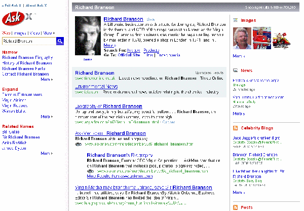
I do like the three panel results screen, though. The left hand panel includes a search box together with links to some of the specialist resources, and the Zoom options (Narrow, Expand, Related Names). It also contains search suggestions that change as you type.
The middle panel contains your search results and on the right panel there are sample results from other types of resources including video, news, images, blogs and encyclopedia. For those who do not think beyond standard web page searching they are a reminder of other, possibly more relevant forms of information.
Ask X results screen


One thought on “Ask X”
Comments are closed.