Microsoft have released a beta search front-end to its Live Search. Called Tafiti, which means “do research” in Swahili, it is intended to help “people use the Web for research projects that span multiple search queries and sessions by helping visualize, store, and share research results”. When you first log in to the site, you are greeted with a clean, Web 2.0-ish minimalist screen. A box tells you that you need to install something called Microsoft Silverlight. Once you have done that, however, the interface changes to what I can only describe as ‘library retro’. A grubby, dog-eared catalogue card [oh dear!] with a search box materialises, and a group of icons representing web, books, news, images and feeds start whizzing around in the bottom left hand corner of the screen, but they do eventually settle down.
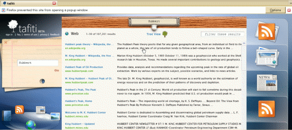
You type your search terms on the card, which then goes off to the left hand side of the screen, and your results are listed in what looks suspiciously like a drawer from a card catalogue filing cabinet. The library theme continues with options to drag and drop items from your results lists to ‘shelves’ on the right hand side of the screen. These can be saved for future sessions. You can switch from the default web search to another type of resource by clicking on the icons in the bottom left hand corner. Images worked fine for me, but I found the layout of the feeds results confusing and loathed the attempt at mimicking a newspaper layout for the news items. I was expecting to see a pile of books for the book search but had no results for any of my searches. Tafiti is experimental so it is not surprising that there are some glitches.
Default web results layout:

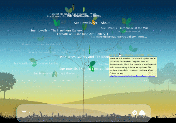
There is an alternative ‘tree view’ for the web results, which is a complete contrast to the default interface. Several reviewers have commented on its similarity to Kartoo but at least that does not make me feel sea-sick. A revolving tree with text continually changing size and dropping in and out of focus is the last thing you want if you are feeling even slightly off-colour! There was an opaque area at the bottom of the screen with a line on it and some symbols that I could not identify. I have since discovered from Philipp Lenssen’s Blogoscoped posting that it is a slider bar that is supposed to allow you to reduce the number of branches and leaves. Well, it did not work for me but perhaps that is because I am using Firefox rather than IE. Two arrow buttons toggle the rotation direction. Those did work but made me feel even more dizzy and confused.
Tafiti tree view:

Phil Bradley was not impressed, to put it mildly. I am in two minds about it. The idea behind Tafiti of bringing together information of different types is great. The implementation, and especially the library theme, irritated me and more importantly distracted me from the content. Ask does a far better job (see my blog posting at http://www.rba.co.uk/wordpress/2007/06/20/ask-rolls-out-new-interface/). I was pleasantly surprised that the Silverlight plug-in worked in Firefox, but seriously annoyed that the right click menu options were disabled as was the back button, the F11 key and the scroll on my mouse.
Overall, Tafiti is interesting and I shall be keeping an eye on it to see how it develops. When it comes to day-to-day searching, though, I much prefer the standard Live.com interface.
