Microsoft have launched their new look for Live.com. It has the now obligatory minimalist look, which was already evident in the previous interface, but has at long last added a link to the Advanced Search option on the home page. Also new to this version is the option to receive an RSS alert for news searches. “Hurrah!” I shouted, “At long last they are listening to users and in danger of threatening Google’s crown”.
Unfortunately, my joy was short lived.
1. The advanced search screen is still pathetic compared to Google’s, Yahoo’s and Exalead’s, and there is no filetype search option. You have to use the ‘filetype:’ command in the default search box
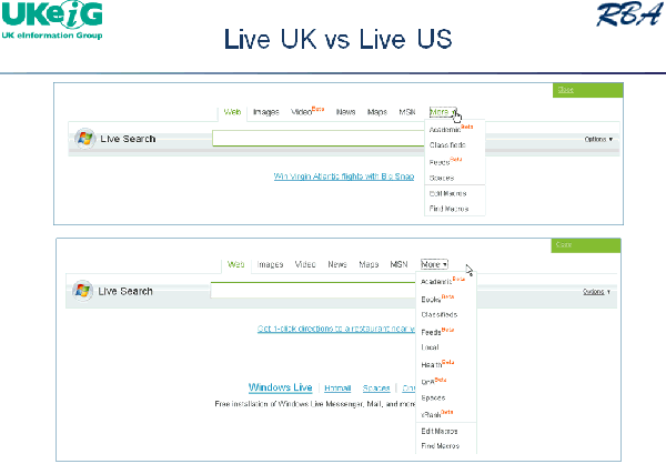
2. A major issue I have had with Live is that it offers different search options and results displays depending on which ‘country version’ you are using (see the slide below from one of my recent presentations comparing the UK and US versions and number 3 on the News search).
Live.com: UK vs US versions – March 2008

In the previous version of Live.com you could force it to switch from, for example, the UK to the US version by going into the Language option and choosing English (US) instead of English (UK). Now, there is no differentiation between US and UK. I thought I might be able to solve this problem by going into Options and changing the location at which Live thinks I am based. It assumes London but even when I tell it that I am in New York, United States it still insists that I am in the UK! A minor issue you might think but if your ISP gives Live an IP address in Frankfurt, Australia or wherever and Live is telling you that it is going to give you customised results according to your location – well, what is the point? Google and Yahoo give you the option to switch between different country versions whenever you want.
3. At long last they have implemented RSS feeds for news search alerts, but then I realised that I was looking at the boring old news results for the UK and not the super-duper display that the US now sees (see my earlier posting on this issue). And there is no way that I can find, other than going through an anonymous proxy server based in the US, to gain access to the US version.
The verdict? I have to partially agree with Phil Bradley’s comment “If I get a delegate on a course asking me why Live Search should be their preferred search engine I simply couldn’t give them a good reason.” They have so much going for them and then they totally mess it up. Their database is the most up to date for many of the sites that I search on; the coverage seems to be better; they have a worthy competitor to Google Scholar in Academic Live; Maps, Books and Live Earth are pretty good too. So why do they keep shooting themselves in the foot with c**p interfaces?