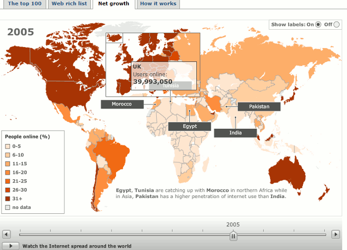
Looking for some interesting stats about the web? Then head straight for this section on the BBC web site (http://news.bbc.co.uk/1/hi/technology/8552415.stm), which is part of SuperPower, a season of programmes exploring the power of the internet. It provides a range of statistics including interactive graphics showing the most visited sites and types of site on the internet (as measured by Nielsen). The top 100 sites graphic breaks down into search/portals, social networks, retail sites, media/news and by country. Move your cursor over a block in the visualistaion and it will display the name of the site, number of unique visitors and percentage market share.
The Web Rich List holds no surprises with Larry Page and Sergey Brin at the top and both worth 17.5 billion USD. The Net Growth map has a slider bar underneath it that you can use to view internet usage over time. Set the slider bar at the year you are interested in, move your cursor over a country and it will tell you the number of users.

‘How it Works’ has a very basic set of slides about how the Internet works but you might find the counters to the right of the slides more interesting. They claim to show the estimated number of internet users in the world, the number of email messages posted so far today (includes spam), the number of blog posts today, and the approximate number of Google searches today. An obvious number that is missing is the number of Tweets but you can find some statistics on Twitter’s own blog at Twitter Blog: Measuring Tweets http://blog.twitter.com/2010/02/measuring-tweets.html