Category Archives: Live.com

Academic Live and Live Books axed

I did a double take when I scanned through my RSS feeds this morning. Live Search have announced that they are closing down Academic Live and Live Books Search. Surely a late report of an April Fool, I thought. Unfortunately it was a genuine posting on Live Search’s official blog. Both sites will be taken down this week and they are winding down their digitization initiatives, including their library scanning and their in-copyright book programs.

I have tried to support Live.com and promote it to those who attend my workshops as a viable alternative to Google. In my experience, it seems to have the most up to date database, often finds pages and documents that the other search engines miss, and has a great command for locating RSS feeds on a web site. But it keeps shooting itself in the foot. The site recently had a makeover, but the presentation of the advanced search is still awful and the only reliable way of using the options is via the command line. Live News has improved greatly and now has an RSS alert option, but only in the US version of Live. See my earlier posting Live.com updates news interface – but only for the US. And it had by far the best link and linkdomain commands but disabled those because of mass automated data mining.

Both Live Books and Academic Live were superior to Google’s offerings. They had different coverage but the advanced search options, for example date and author search, actually worked in Live, and Academic Live had options for exporting records to RefWorks and EndNote, albeit one by one. Live goes on to say in its announcement that books and scholarly publications “will continue to be integrated into our Search results, but not through separate indexes.” Sorry, but not good enough. That will work fine if you know exactly what you are looking for and it is a very narrowly focussed search, for example I can easily find my husband’s papers on ESR studies of zeolites, but it is impossible to limit a search to books or peer reviewed papers on a more general topic.

It seems that this part of the market does not make enough money for Live and it says that it will now “focus on verticals with high commercial intent, such as travel, and offer users cash back on their purchases from our advertisers.” Bribery appears to be part of the new company policy: another headline in my morning feed update reads “Office 2007 plus petrol: Microsoft Australia is trying to lure Aussies to buy Office 2007 with petrol”!

Forget about self-inflicted metatarsal wounds, I am beginning to suspect that Live has a serious death wish. I wonder what will be the next part of Live to go?
New look for Live.com: two steps forward, three steps back

Microsoft have launched their new look for Live.com. It has the now obligatory minimalist look, which was already evident in the previous interface, but has at long last added a link to the Advanced Search option on the home page. Also new to this version is the option to receive an RSS alert for news searches. “Hurrah!” I shouted, “At long last they are listening to users and in danger of threatening Google’s crown”.

Unfortunately, my joy was short lived.

1. The advanced search screen is still pathetic compared to Google’s, Yahoo’s and Exalead’s, and there is no filetype search option. You have to use the ‘filetype:’ command in the default search box

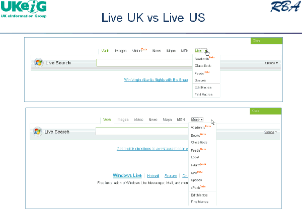
2. A major issue I have had with Live is that it offers different search options and results displays depending on which ‘country version’ you are using (see the slide below from one of my recent presentations comparing the UK and US versions and number 3 on the News search).

Live.com: UK vs US versions – March 2008

In the previous version of Live.com you could force it to switch from, for example, the UK to the US version by going into the Language option and choosing English (US) instead of English (UK). Now, there is no differentiation between US and UK. I thought I might be able to solve this problem by going into Options and changing the location at which Live thinks I am based. It assumes London but even when I tell it that I am in New York, United States it still insists that I am in the UK! A minor issue you might think but if your ISP gives Live an IP address in Frankfurt, Australia or wherever and Live is telling you that it is going to give you customised results according to your location – well, what is the point? Google and Yahoo give you the option to switch between different country versions whenever you want.

3. At long last they have implemented RSS feeds for news search alerts, but then I realised that I was looking at the boring old news results for the UK and not the super-duper display that the US now sees (see my earlier posting on this issue). And there is no way that I can find, other than going through an anonymous proxy server based in the US, to gain access to the US version.

The verdict? I have to partially agree with Phil Bradley’s comment “If I get a delegate on a course asking me why Live Search should be their preferred search engine I simply couldn’t give them a good reason.” They have so much going for them and then they totally mess it up. Their database is the most up to date for many of the sites that I search on; the coverage seems to be better; they have a worthy competitor to Google Scholar in Academic Live; Maps, Books and Live Earth are pretty good too. So why do they keep shooting themselves in the foot with c**p interfaces?

Live.com updates news interface – but only for the US

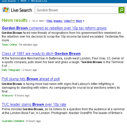
Following Live.com’s announcement about its revamped news results, I waited with bated breath to see the new improved service in operation. Alas, nothing happened and after several days of monitoring and hearing from other bloggers how wonderful it is I was still getting the same boring old results. Then I twigged that it was probably because Live.com automatically kicks me into the UK version of its services rather than the US one. Those of us in the UK see a straight forward linear listing of text articles.

Live News – UK version

Live News UK version

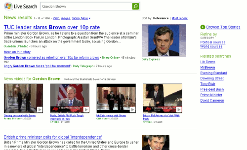
It was only when I changed my Language settings from English (United Kingdom) to English (United States) that I saw what all the fuss was about. The results page, as many have commented, is more ‘Google-like’. The appearance is similar, stories are clustered together and photos included in the listings. One up on Google, though, is the inclusion of news videos. Roll your cursor over the thumbnails and you see a preview.

Live News – US Version

Live News US Version

Google News

Google News

Overall, I prefer Live’s presentation of the results to Google’s but Live still does not offer RSS feeds for alerts but claims that this will be appearing soon. Also planned is the incorporation of blogs into the search process.

As an aside, Google News has started pulling out quotes from the articles and displaying at them at the top of the page. Thanks to Phil Bradley for the alert.

Live link and linkdomain comands gone again

As Greg Notess and others have already noted, Live.com’s link and linkdomain commands are in a mess again. After they had been disabled in their original form, they reappeared as +link: and +linkdomain: commands. I noticed last week, though, that the +linkdomain was generating some very strange results. Much as I would like to believe that I am very popular I do not honestly believe that over 500,000 people/pages/sites link to my web site! Yahoo’s result of 2895 seems more realistic. Now Live’s commands have gone AWOL again.

Using Live’s Advanced Search screen I can still use the links option, type in the URL of the page and the syntax that it comes back with is link:http://www.rba.co.uk/. But that only gives me 7 results and two of those are internal links on my own site. So I guess it is back to using Yahoo for identifying incoming links.

Live’s ‘linkfromdomain:’ is still working.

Live.com link commands are back

Live.com‘s link and link domain commands have been back for a quite a while. Microsoft did not not announce their re- appearance and I have forgotten who told me that they were back online, but Paul in Arizona reminded me in a comment to my original posting regarding their departure that I had not posted about their re-emergence.

There is one important change to the command. You have to precede both the link: and the linkdomain: commands with a plus sign. For example, to find pages that link to the UKeiG’s training and meetings page you would type in:

+link:www.ukeig.org.uk/training/

To find pages that link to anywhere on the UKeiG web site you would type in:

+linkdomain:www.ukeig.org.uk

Google has a link command which is virtually useless as it lists a small fraction of the pages that link to your starting page. Yahoo has both a link and linkdomain command but my experience is that they do not list as many pages as Live.com. This suggests to me that Live’s database of web pages is larger than Yahoo’s.

The link commands are extremely useful in tracking down pages or sites that are similar to one that you already have, the principle being that pages of similar content and type generally link to one another. It is also a great way of identifying links and networks between companies and organisations.

Microsoft Tafiti

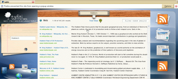
Microsoft have released a beta search front-end to its Live Search. Called Tafiti, which means “do research” in Swahili, it is intended to help “people use the Web for research projects that span multiple search queries and sessions by helping visualize, store, and share research results”. When you first log in to the site, you are greeted with a clean, Web 2.0-ish minimalist screen. A box tells you that you need to install something called Microsoft Silverlight. Once you have done that, however, the interface changes to what I can only describe as ‘library retro’. A grubby, dog-eared catalogue card [oh dear!] with a search box materialises, and a group of icons representing web, books, news, images and feeds start whizzing around in the bottom left hand corner of the screen, but they do eventually settle down.

You type your search terms on the card, which then goes off to the left hand side of the screen, and your results are listed in what looks suspiciously like a drawer from a card catalogue filing cabinet. The library theme continues with options to drag and drop items from your results lists to ‘shelves’ on the right hand side of the screen. These can be saved for future sessions. You can switch from the default web search to another type of resource by clicking on the icons in the bottom left hand corner. Images worked fine for me, but I found the layout of the feeds results confusing and loathed the attempt at mimicking a newspaper layout for the news items. I was expecting to see a pile of books for the book search but had no results for any of my searches. Tafiti is experimental so it is not surprising that there are some glitches.

Default web results layout:

Tafiti default layout

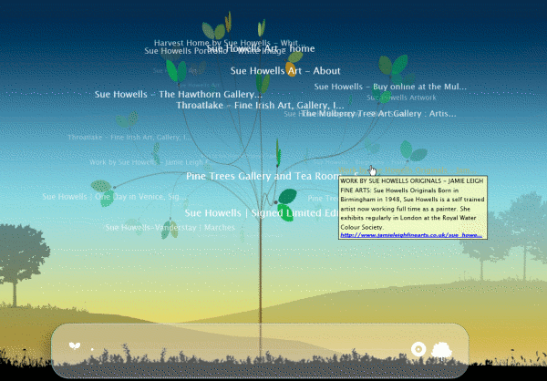
There is an alternative ‘tree view’ for the web results, which is a complete contrast to the default interface. Several reviewers have commented on its similarity to Kartoo but at least that does not make me feel sea-sick. A revolving tree with text continually changing size and dropping in and out of focus is the last thing you want if you are feeling even slightly off-colour! There was an opaque area at the bottom of the screen with a line on it and some symbols that I could not identify. I have since discovered from Philipp Lenssen’s Blogoscoped posting that it is a slider bar that is supposed to allow you to reduce the number of branches and leaves. Well, it did not work for me but perhaps that is because I am using Firefox rather than IE. Two arrow buttons toggle the rotation direction. Those did work but made me feel even more dizzy and confused.

Tafiti tree view:

Tafiti tree view

Phil Bradley was not impressed, to put it mildly. I am in two minds about it. The idea behind Tafiti of bringing together information of different types is great. The implementation, and especially the library theme, irritated me and more importantly distracted me from the content. Ask does a far better job (see my blog posting at http://www.rba.co.uk/wordpress/2007/06/20/ask-rolls-out-new-interface/). I was pleasantly surprised that the Silverlight plug-in worked in Firefox, but seriously annoyed that the right click menu options were disabled as was the back button, the F11 key and the scroll on my mouse.

Overall, Tafiti is interesting and I shall be keeping an eye on it to see how it develops. When it comes to day-to-day searching, though, I much prefer the standard Live.com interface.

Live Search Images adds face search

First Exalead adds an option to limit your image search to faces, then Google, and now Live Search has joined the gang. In terms of ease of use, it is not as slick as Exalead’s but not quite as clunky as Google’s. You first of all carry out a search in Live Images and then add filter:face to your search search strategy or filter:portrait. If you want to look for black and white images you add filter:bw. At present you have to remember the commands but they say they are looking at how to make these features intuitively accessible through a drop-down menu or some other means.

On my image test searches on Live.com I cannot honestly say it was better or worse than Exalead or Google. None of them are perfect. They do remove most of the non-people images but all three also lose relevant faces and ‘portraits’.

Live.com takes link commands offline

Those of you who use the link commands in Live.com will have noticed that over the past week link: and linkdomain: have been returning blank results pages. This is not a temporary glitch but has been done on purpose by Live. According to their blog:

” We have been seeing broad use of these features by legitimate users but unfortunately also what appears to be mass automated usage for data mining. So for now, we have made the tough call to block all queries with these operators. We are doing our best to get this back online as soon as possible in a manner that allows folks that use this functionality for real queries.”

The linkfromdomain: command, which lists all the pages that a web site links to, is still working.

While Live makes up its mind about what to do with the commands try link and linkdomain in Yahoo. The results are not always as comprehensive as Live.com’s but will probably suffice in most situations. The syntax for the Yahoo’s link command is slightly different. To find pages that link to a specific page on a site it is:

link:http://www.yoursite.com/pagename.html

Note that you must include the ‘http://’

To find pages that link to any page on a site the syntax is similar to Live’s:

linkdomain:yoursite.com

Google also has a link command but it displays a small fraction of the results.

Windows Live – linkfromdomain command

This a new command from Windows Live search (formerly MSN Search) that gives you a list of links to other pages from your specified domain, for example linkfromdomain:rba.co.uk. This can be useful if you have a trusted source of information and want to see what other sites they recommend or link to. It can also be used as a means of assessing the bias of a site so that you can see the diversity, or lack of it, in the pages that the site ‘references’.

MSN Search becomes Windows Live

There I was, standing in front of a workshop full of seriously proficient Internet searchers, and running through my list of Google alternatives. I get to MSN Search, hit the bookmark and stand there in bemused silence for what seemed like an eternity but was probably only about 10 seconds. In the couple of hours since I had checked the site, MSN Search had become Windows Live (http://www.live.com/).

The screen may look very different but the search features and commands, some of them well hidden, are the same. The home page is the most obvious difference but the Search Builder, now renamed Advanced Search, has disappeared. It reappears once you display your results list. Why? I can only assume that Microsoft thinks that all searchers only resort to advanced search options when their initial basic search has failed. Not that it really matters, since some of the really good advanced options are not listed in the menu anyway and you have to use them by going into ‘command line’ mode.

For example:

car ownership UK filetype:xls

The home page now has links for Web, Images, News and Local search but the free access to Encarta has been dropped. I have, though, seen various reports saying that you can still get to it by searching on encarta plus your search terms or site:encarta.msn.com plus the terms.

It would also be helpful to have the More option on the home page rather than having to generate a results page to see it! At present More gives you access to a Feeds search and Academic Live, both of which are still in beta. I first reviewed Academic Live in April 2006 (http://www.rba.co.uk/rss/2006/04/windows-academic-search.html). Not much seems to have changed in functionality but I note they have added many more journals to the database, including biomedical and healthcare titles. I subscribe to just about every official Microsoft alerting service but the enhancements do not seem to have made it to any of them. This is an ongoing problem with MSN Search/Windows Live; if you want to keep up with developments you have to regularly hunt around the site for changes and review the help files for the new and really useful commands*.

The Local search works pretty well, but I need to look at it in more detail and compare it with other similar services before I pass final judgement. One problem that struck me straight away was that although it started off with a UK map it transported me over to the US when I searched for churches in Caversham. I had to include UK in the location to force it back to the UK. The satellite images are slightly higher resolution and crisper than Google’s for my location, and they seem to be more up to date.

Apart from Academic Live, I am not yet convinced that I should be using Live.com as my regular search engine. The web search results still seem to be more consumer and retail orientated than Google and Yahoo, and I am usually looking for research or statistics on a subject. A search on ‘gin vodka sales uk’ in Google and Yahoo will bring up market research reports and industry stats galore: on Live.com, the first is a statistical overview but the remainder on my first result page are online stores where one can buy gin and vodka! This is not actually a problem, and there are times when you may want to bias the search in this way, but it is as well to be aware of it.

Overall, a nice clean interface but very little has changed under the bonnet and some useful search features have disappeared from view.

*One useful command that you might have missed is the feed command. The scenario: you are, like me, a news and RSS feed junkie. You have found a really good news site covering your subject or industry sector but surely it cannot be true that they do not have RSS feeds? Check by using the Live.com feed command combined with the site command. For example:

site:superduperwidget.co.uk feed:superduperwidget.co.uk

Try it on the BBC web site and you’ll discover that they have 1,956 feeds!