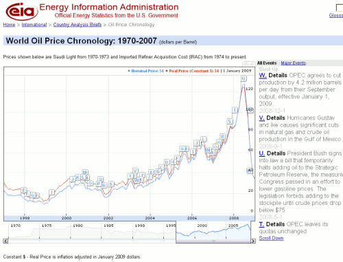
The EIA World Oil Price Timeline is an annotated graph of the price of Saudi Light from 1970-1973 and Imported Refiner Acquisition Cost (IRAC) from 1974 to present. The blue line on the graph is the nominal price in US dollars per barrel and the red is the inflation adjusted price in January 2009 dollars. You can scroll along the time line to select a time period to view in more detail.

The letters on the graph refer to major events affecting the oil industry and short summaries of these are listed to the right. There are no links to the full articles and no information about the source of individual stories. There is, though, a list of the sources that are used at the bottom of the page and these include Energy Information Administration, Financial Times, International Oil Daily, Lloyd’s List and Reuters.
This is a neat tool that enables you to not only view the changing price of oil over the years but also to identify the events associated with those changes. As an example, take a look at the period 1975-1985 when the the oil price rose dramatically in real terms.