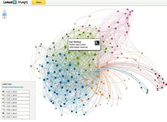
LinkedIn has added a new feature called InMap that enables you to visualise your LinkedIn connections, how they are connected and to identify gaps in your network. Go to http://inmaps.linkedinlabs.com/, log in with your LinkedIn user name and password and it should then create a map showing the connections between the people in your LinkedIn Network. I’m afraid I failed at the first hurdle: my profile was only 50% complete and it has to be 75% before a map can be generated. A slap on the wrists for me then and a crafty way to make you give LinkedIn more data about yourself. (Yes, I know I’m a cynic).
The result was interesting but confusing and, frankly, a bit of a mess. I’ve seen some other people’s maps – there are options to share them on Twitter, Facebook and LinkedIn – and one resembled a beautiful butterfly. Mine looks like an exploding brain; perhaps LinkedIn is trying to tell me something.

The colours are supposed to represent groups of people connected in some way, for example people you have worked with at a particular company or met at conferences. To reveal the name of the person represented by the dot simply move your cursor over it. You can also see all of the names on your map at once by increasing the size, either by clicking on the plus symbol in the upper left hand corner or using the scroll wheel on your mouse. Once you have identified the common factor you can add a label to the colour in the legend in the lower left hand area of the map. And this is where I came unstuck a second time. The only group I could definitely identify as having a common feature was the one containing the purple dots on the right hand side of my map. These were people I had met at executive search and recruitment conferences, but there are also some in this category who were blue, green and orange dots.
The problem, I suspect, is that I know many of my network via multiple routes. I think I first met Val Skelton (a green dot) at TFPL but only 3 or 4 other green dots had that connection. Perhaps it was that we often meet up at the Online Information conference and exhibition? No, those contacts where represented by every colour on the map. Or maybe she is one of the Information Today crowd? That theory didn’t work out either. As for the small red dots they are here, there and everywhere and InMap failed to pull then into a neatly contained area on my map.I’m tempted to label them as anarchists!
Trying to think more positively about this tool, the map suggests to me that the majority of my network cannot be pigeon-holed. They are unique individuals, each with their own specific set of skills and the ability to move from one sector to another with ease. And I am more than happy with that.


