Google has rolled out Bing style results for its image search. If you have never used Bing Image search take a look now. Several people in my latest search workshop loved it so much that they included it in their top search tips (http://www.rba.co.uk/wordpress/2010/07/16/top-search-tips-14th-july-2010-workshop/). Bing Images results do not do page by page results: Bing Images does continuous scroll. As you move down through the results more images are loaded, and more, and more. There is no click “next page” to distract you. And now Google has copied the style… sort of.
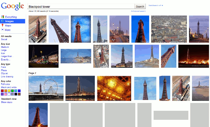
I have several problems with Google’s new image results layout. The first thing that struck me was that the images are all crammed in side by side to neatly fill the rows. Have the images been cropped to obtain the desired effect or have they been selected by dimensions, rather than relevance, to fill the ‘mosaic’? Bing has four images in each row regardless of their relative dimensions so there is more white space between the images, which is easier on the eye. Google’s display makes me feel as though I’m in a jam-packed standard class commuter train carriage: Bing is the more spacious, relaxed first class.
Neither Google nor Bing display by default image information, but you only need to hover over the image in which you are interested to see further details. The information is almost the same in both but Bing has an additional option to look for more sizes. The size option is great if you want to use an image but do not want to have the trouble of re-scaling it for your particular application. But not all images are available in ‘more sizes’. It depends on whether or not other web pages have reproduced the image with different dimensions. If you own a particular image with strict copyright protection and you know you have only posted a specific size on one page, this can be a useful tool in tracking down copyright violations.
When it comes to scrolling down through your results, Google seems to have lost the plot. Work your way down through the results on Bing and the display smoothly unfolds. Google’s is stop start stop…….start, stop. And it is so sloooooooow. I can almost hear the cog wheels clanking. Another distraction in Google is that batches of images are separated by the text ‘page 2’, ‘page 3’, ‘page 4’ etc. Why? The whole point of continuous scrolling of results is that there are no pages of results.
As a comparison, here are Google’s results for an image search of Blackpool Tower:
Here are Bing’s results:
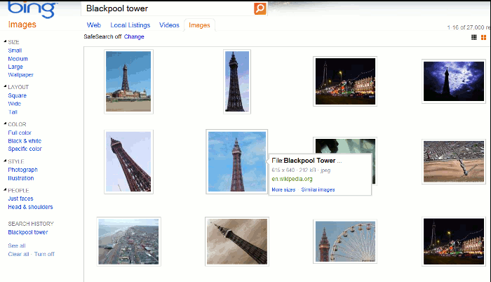
Bing is so much faster, smoother and slicker.
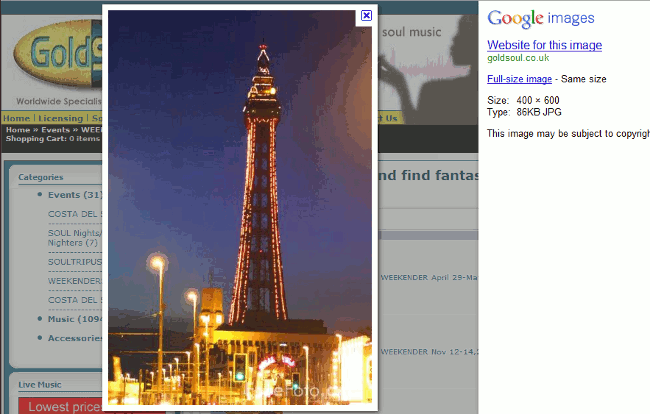
When it comes to clicking through on an image Google almost wins. Google gives you a background of the web page and superimposed upon that is the full size image. To the right is information about the image with the warning “This image may be subject to copyright”.
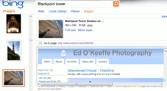
Bing’s does not have the same initial impact, but it does display a scrollable list of thumbnails of your search results to the left of the screen. This is very useful if the image you have selected turns out not to be exactly what you need and you want to review the alternatives.
Who wins? It has to be Bing. It is much faster, easier on the eye, has equally relevant results and has an extra ‘more sizes’ option. And finally… it just feels right.
